Phone mockup courtesy of rawpixel.com via freepik.com
A project to create a more user friendly experience on the customer portal for Jönköping Energi – a local electricity provider.
This idea was born after I had visited the existing customer portal, and left the site feeling frustrated and confused. Upon analysing my own goals on the site, and interviewing potential consumers, an improved interface was created.
The main goal of the redesign was to make it more user-friendly, easier to use and more personal. A new feature called "Elsmarta Tips" was added, where the user can find recommendations on how to lower their electricity consumption. This feature was added with Jönköping Energi's value of being environmentally friendly in mind.
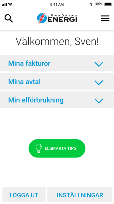
Customer portal landing page
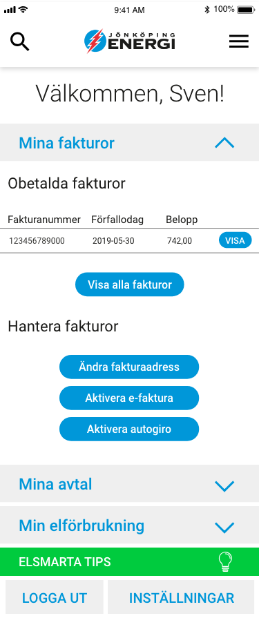
Customer portal showing invoices
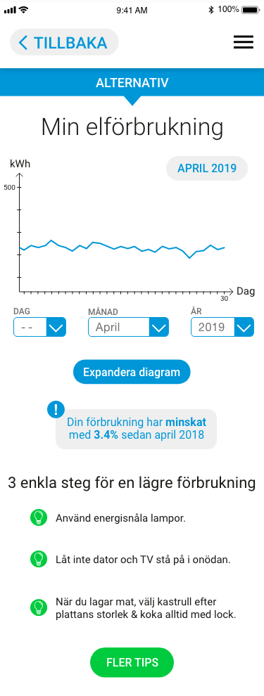
Customer portal overview of consumption
The new user interface is highly simplified by grouping the possible actions in categories. Colours have changed to create consistency, and a burger menu has been placed in the global navigation to allow the user to leave the customer portal.
To view the actions within the category, the user clicks it and a preview of the content is shown. By allowing previews on the landing page, the user will find whether the page is relevant – and may even finish their errand on the page directly from the landing page.
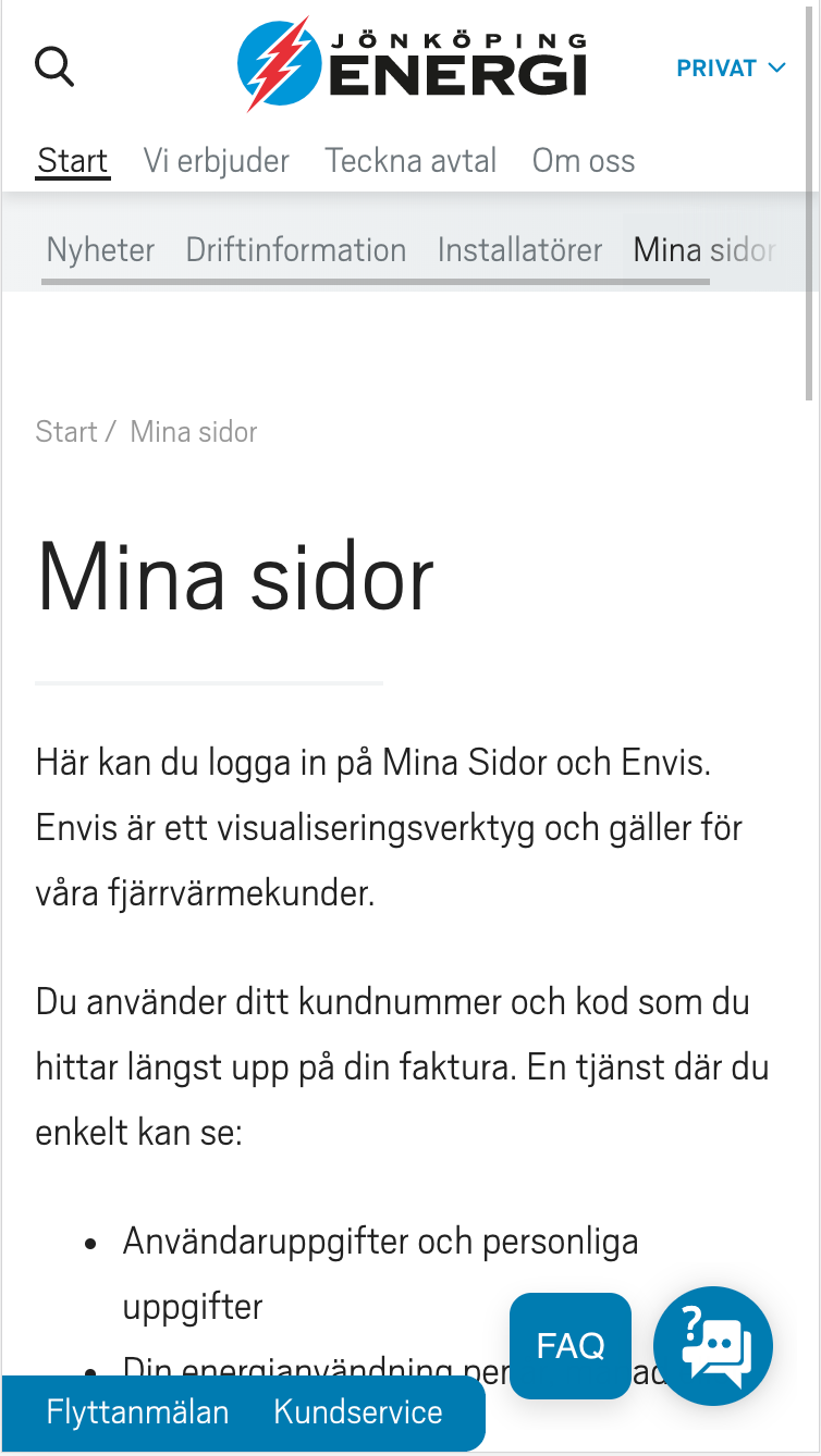
Jönköping Energi original website, link to log in page
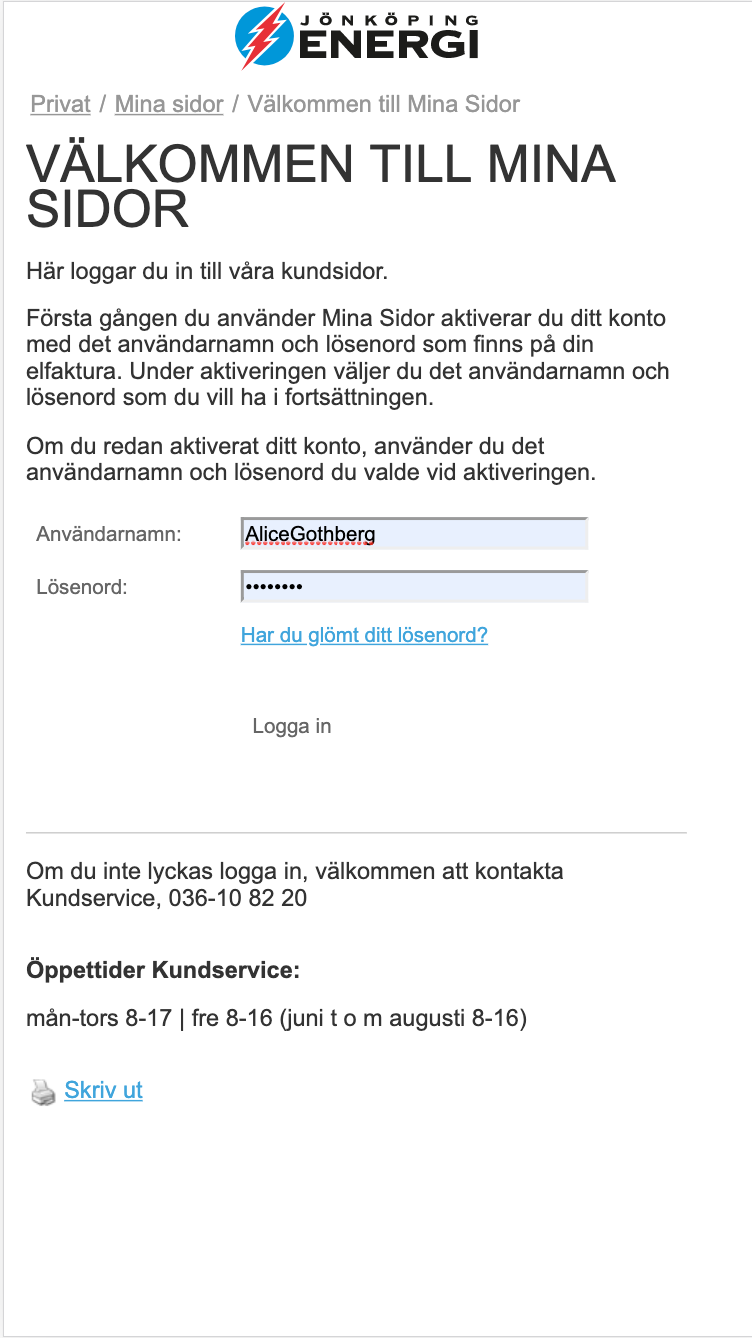
Jönköping energi original customer portal, log in form
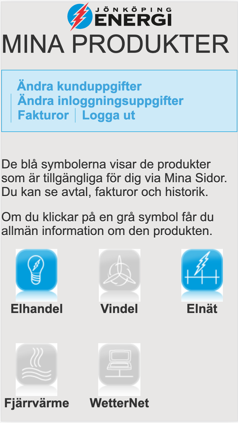
Jönköping energi original customer portal, logged in landing page
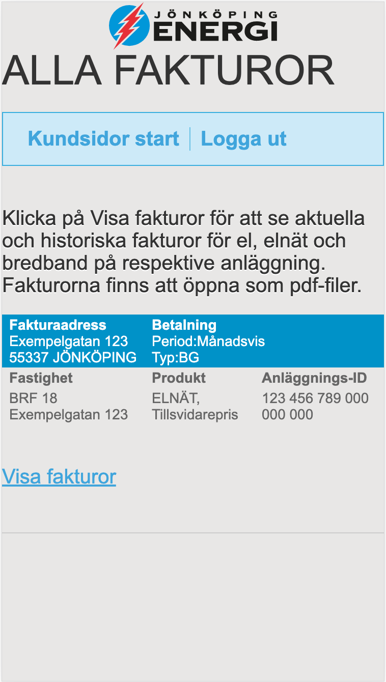
Jönköping energi original customer portal, invoices page
Looking at the original interface for Mina Sidor – the customer portal – there are a couple of things that need changing. The log in option is only available as a submenu item on the main webpage's start page, and the customer portal pages don't have an option to go back to start without logging out.
In addition to restructuring and prioritising content, the depth of the portal was changed to only including pages that are one step away from the landing page.
Another addition to the improved customer portal is the option to log in via BankID – this makes it easier for any customer to log in without having to remember a password.

